IE < 9

Please update your browser for better experience

update now

Loading

Storytelling NPS – Purina study case

  • Figma case
  • 2022

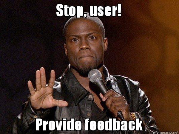
Sometimes, after hours user activity careful study I want to scream: hey, user, why have you are left the site without feedback?

It’s 3 minutes of your time, but in this way, you can make our site and products better for your further experience too. Why don’t you want to engage in it? You and I are the dream team, and we could make great results together.

But users left the site without response to this scream of UX researcher soul. Here, I started to think why our NPS survey of net promoter score didn't work.

It's time to take the red pill and find out just how deep this rabbit hole goes.

Little notation before our trip

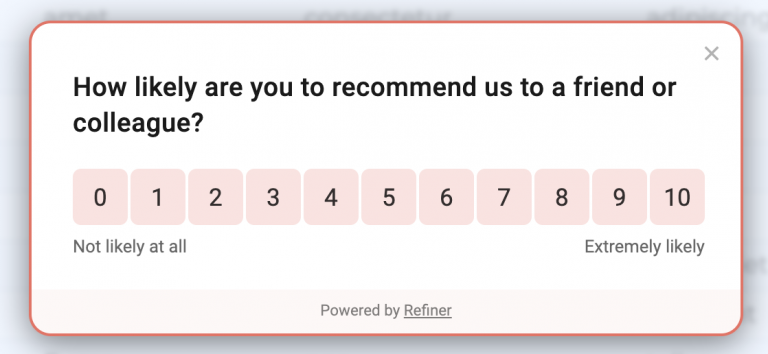
NPS (Net promoter score) is a scale that measured customer loyalty and satisfaction from interaction with your product. Generally, NPS survey looked like a scale from 0 to 100.

To understand all aspects of the problem, I left out my company site and tried to research another company website with the same survey type.

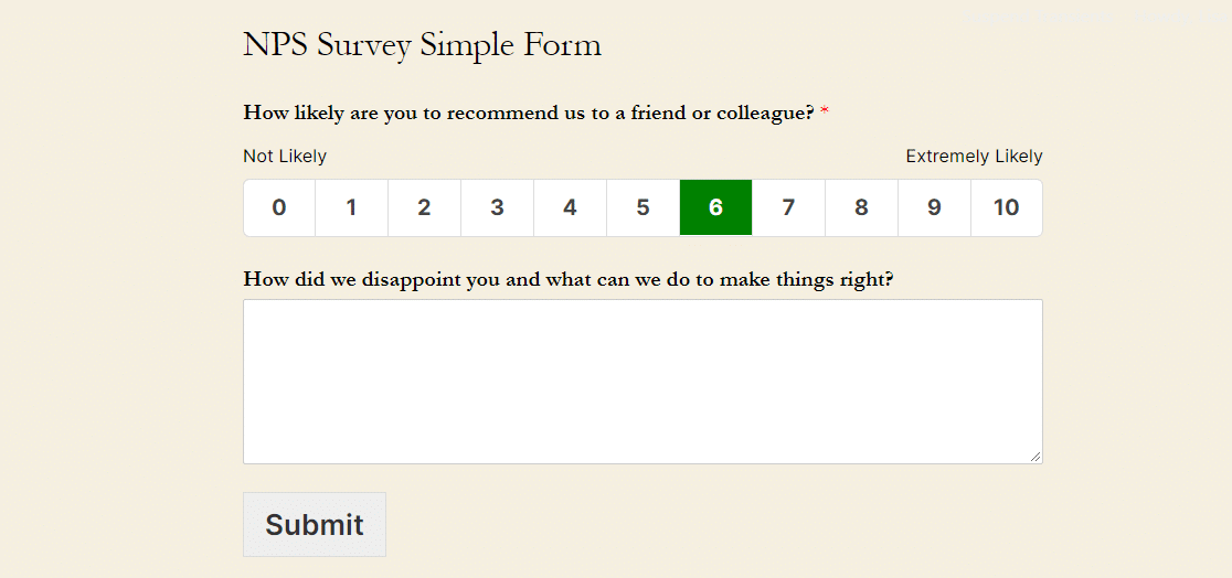
What did I see? A lot of just the same surveys were in just the same boring design, questions. On one site, NPS locked my screen and forced me to answer it. Oh my gosh, it seems like the criminal gets a knife near my throat and forced me to fill this text area after I clicked to survey button.

After a third site with a survey, I was bored and disappointed. I completely understand my user because I didn’t want to fill the text field and click to this awful scale. Frankly speaking, I didn’t remember what site I already completed NPS and where I didn’t do that.

Why does NPS need to be changed?

- It is a boring and similar design in all NPS surveys.

- I want more engagement and dialogue with my user

- Time is money. I don’t want to waste my time writing why your product is not best for me or vice versa. Only in the case when I’m so happy with your product’s experience or so upset with my product interaction, I will write about it.

- Most important – some median scores like 5 or 6 without any text support didn’t give UX researcher any useful data about users, their experience or product interaction.

Thus, we need our red pill.

Have you ever thought about the reason for the popularity of computer game “Sims”? Users are engaged with the game, they can build new opportunities and get prizes for their efforts. Just the same thing we have in mobile app “My story” which not only engaged people by creating their own worlds but tell stories that user can choose different ways to resolve problems and have various ends of the game.

Let’s try to extrapolate these two things (engagement and storytelling) to our NPS survey. Also, I expanded the scope of this survey and made it more useful for UX researcher. For this purpose, I added to general questions special questions.

For example, I use the profile of Purina company and their target audience – cat and dog owners. Let’s see how it works.

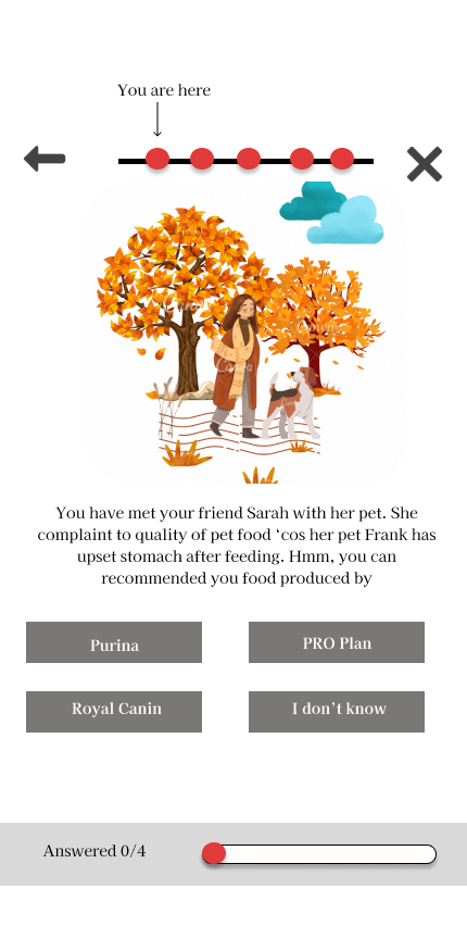
The first screen is the start of the dialogue with user’s virtual friend Sarah and her dog Frank that has upset stomach after poor-quality food. Sarah needs user’s advice. Here, a user has 4 variants of the answers:

Purina One

Royal Canin

Pro Plan

I don’t know

As we know that Purina One and Pro Plan are just the same brands - Nestle. If users choose one of these variants (Purina one or Pro Plan) it means that users have lack of knowledge about Purina brand. Here, the company needs to conduct PR-company to increase the level of knowledge about the brand.

Royal Canin is the competitor of Purina. If users choose this variant, thus its user belongs to the competitor’s party. I don’t know – not bad answer. The user didn’t belong to Purina or to Purina’s competitors, and now it’s the best moment to connect this user to your party.

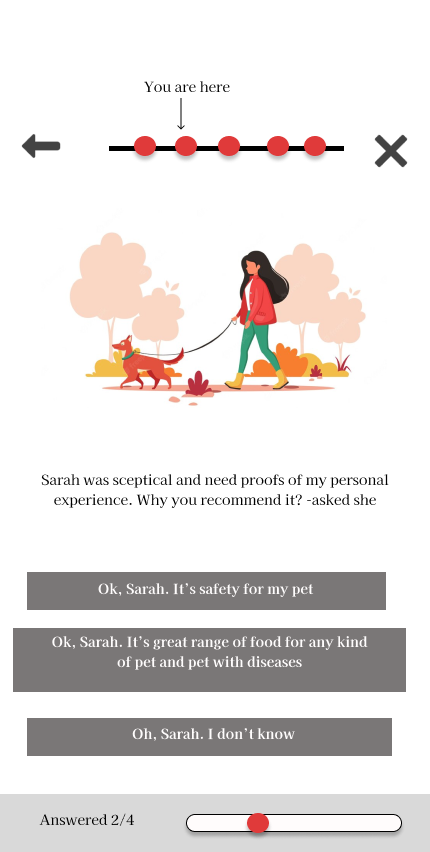
The second screen showed to user sceptical Sarah. You need to convince her (or not) why your choice is right. If a user has chosen a competitor in the previous step, you will know why this user prefers the competitor’s product.

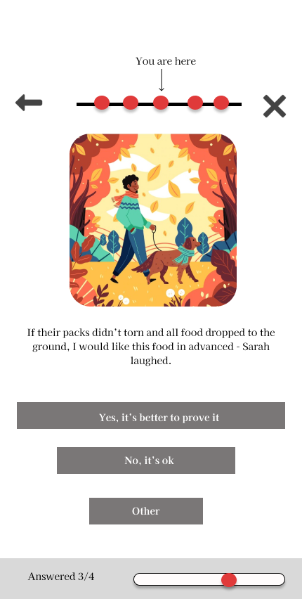
The third screen is dedicated to the user’s pain about using the product. As we can see, an owner often dropped the pet’s food to the floor (a result of bad packing) and a pet used the situation. As a result, a pet struggled with upset stomach and adiposity. Here, user can agree or disagree with Sarah.

-

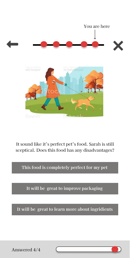
In the last screen of the survey, the user continued the dialogue with Sarah and can choose the disadvantage of the product.

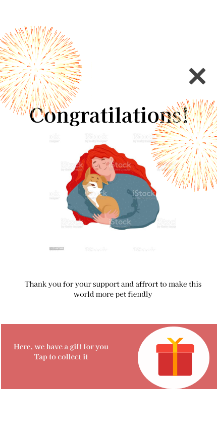
Finally, the user completed the test, see congratulatory salute and can take the gift for his affords. The gift is a white-paper with a list of healthy pet food for one week and the ability to buy all this food in one click.

In this survey, I tried to immerse the user in the usual atmosphere and tell the story about Sarah where the user can choose the answer and engage with this story.

Using this template, you can understand

- Advantages and disadvantages of your product

- Level of trust and recognition of your brand

- What does the user think about your competitors?

I hope you stayed engaged all this time

Let’s build UXiverse together!

Prototype here

next project

User persona study
arrow